Treasure hit
The game | mobile app
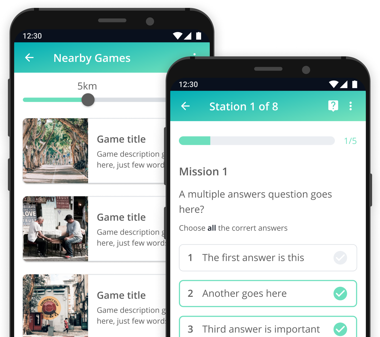
introduction
ux challenges
– Connecting all teams playing within a game to boost the competition.
– Increasing the players’ sense of safety and security while playing outside.
– Creating an effortless user flow that will allow the players enjoy the game even more.
RESEARCH
user RESEARCH
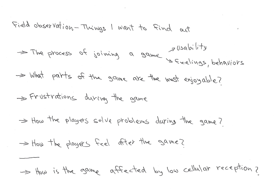
The first part of my research for this section was observation on teams playing the game, while monitoring how they interact with the app. Before going out, I prepared a list of objectives that were important for me to identify.
The second part of my research included interviews with the players, both before and after the game, to gain a better understanding of the whole process through their eyes.
insights
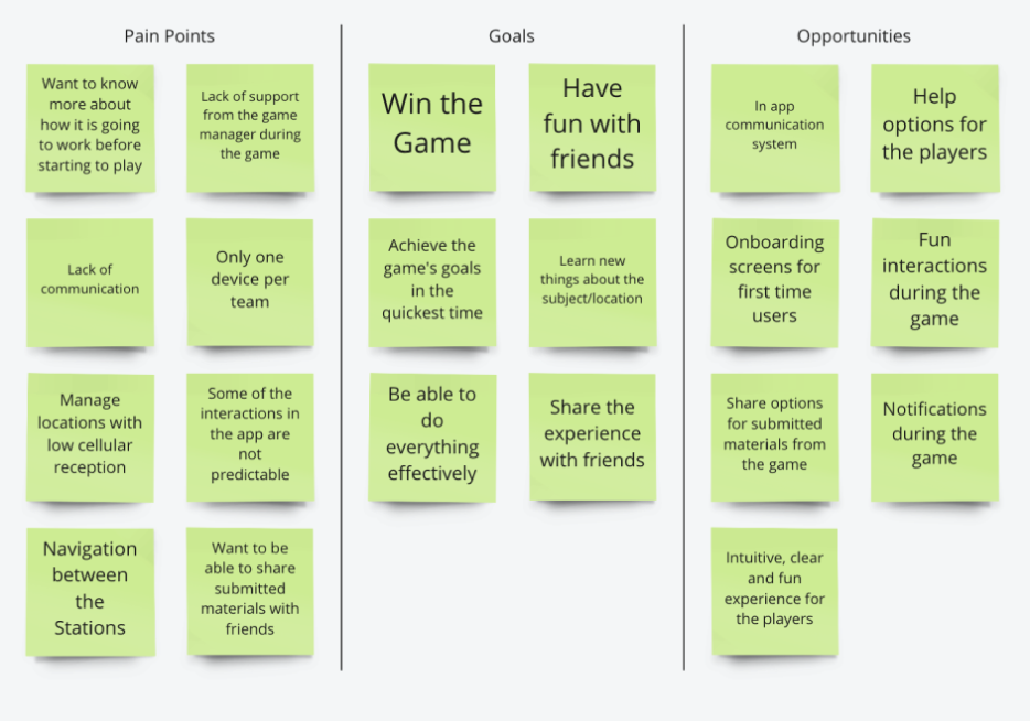
– The players want to have fun. The learning is less important to them.
– Communication, between the teams and with the game manager, is a key requirement.
– Lack of cellular reception affects the game and may cause problems while completing tasks and submitting answers.
– Users would like to be able to review the answers and tasks after completing the game, and see what other teams have accomplished.
user flow
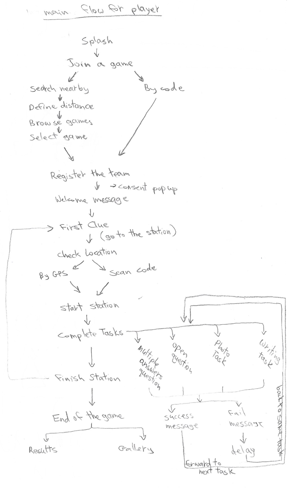
wireframe concept
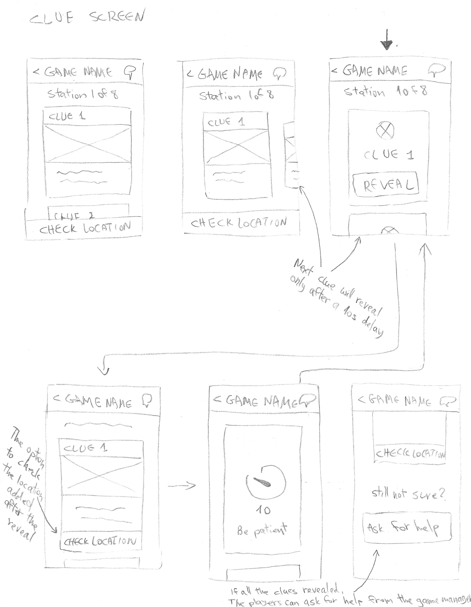
The next step was to put together and examine low fidelity wireframes to get better understanding of the flow in a visual way. Through this quick process, I was able to explore how to design the user experience in more intuitive, clear and fun ways.
For example, finding a way to gamify the exposure of the Clues was a small challenge that I enjoyed solving.
wireframes flow
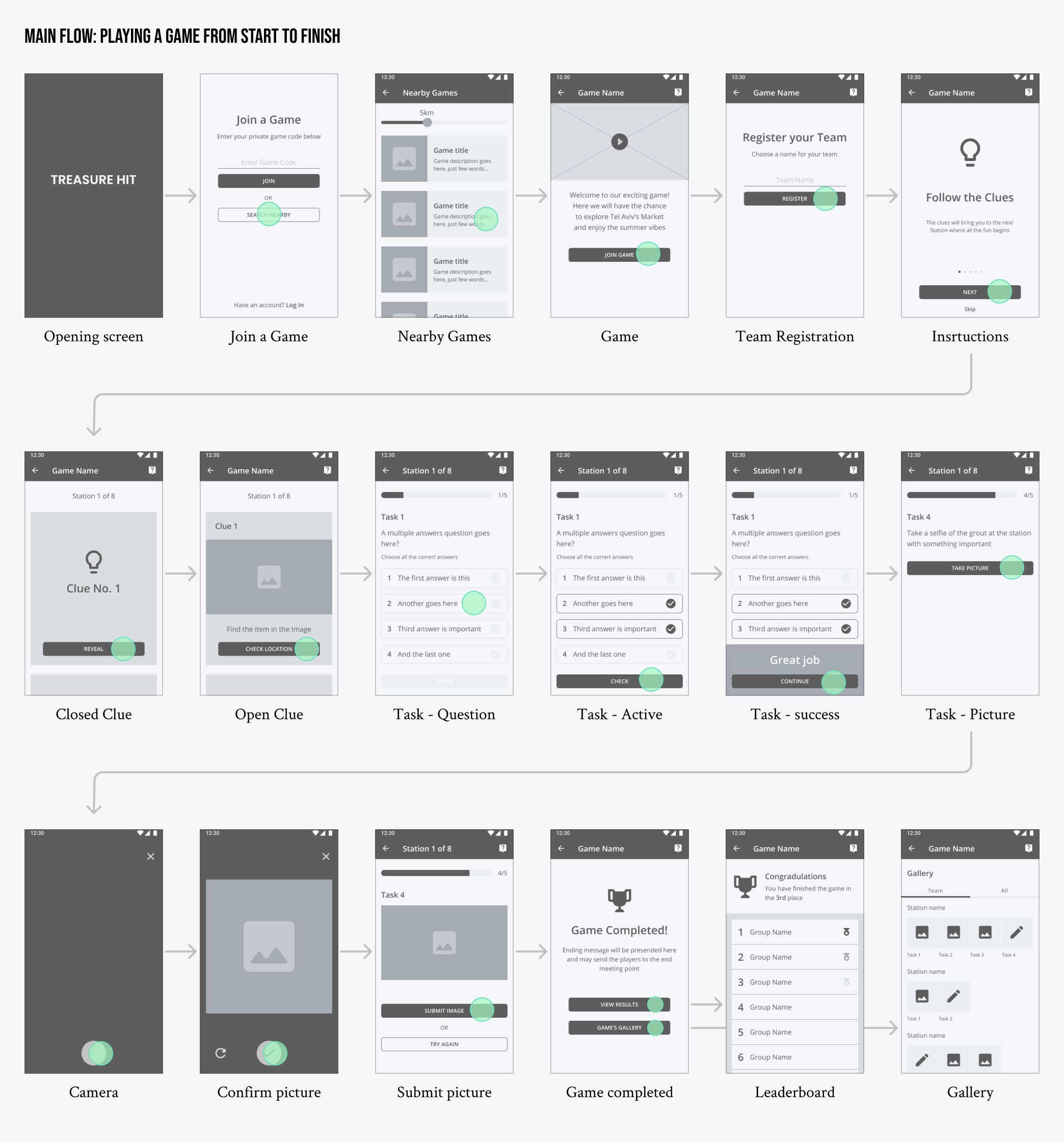
to summarize
before
– Educational oriented look and feel.
– Lack of communication options.
– Unpredictable interactions.
– Outdated user interface.
ux solution
after
– Effortless and fun user flow.
– Communication and notifications during the game.
– Accessible leaderboard and gallery.
– Updated user interface.
The mobile app features
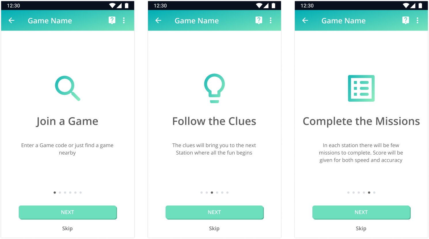
Instructions
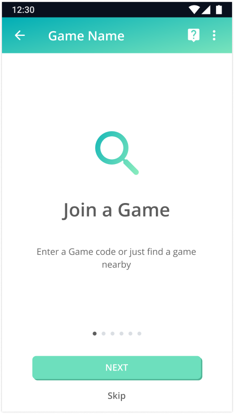
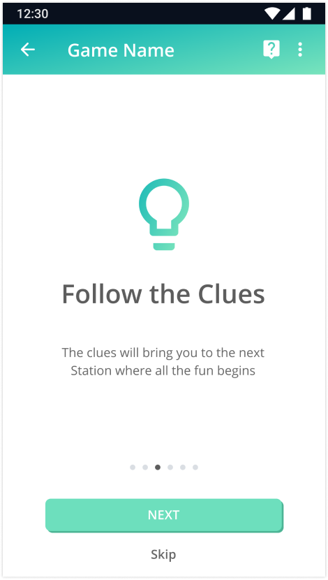
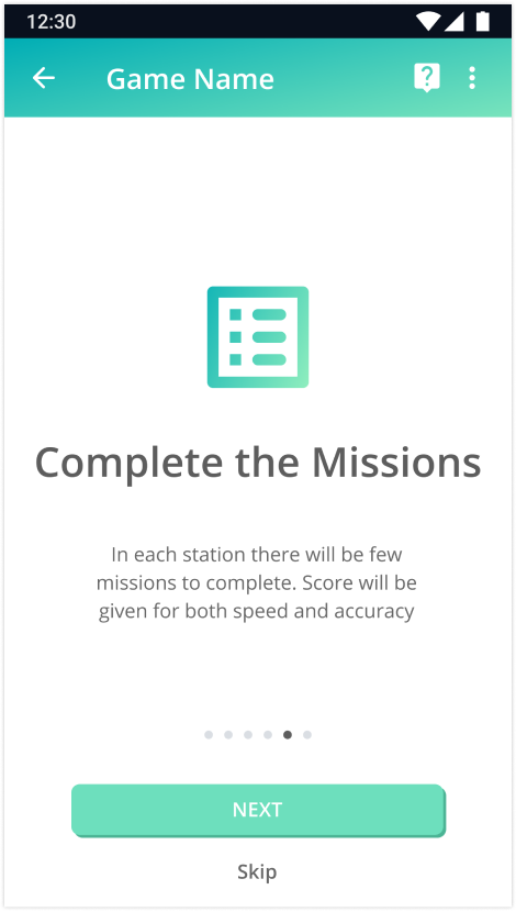
Instructions were added to reduce players’ uncertainty and shorten their learning curve.
Join a Game
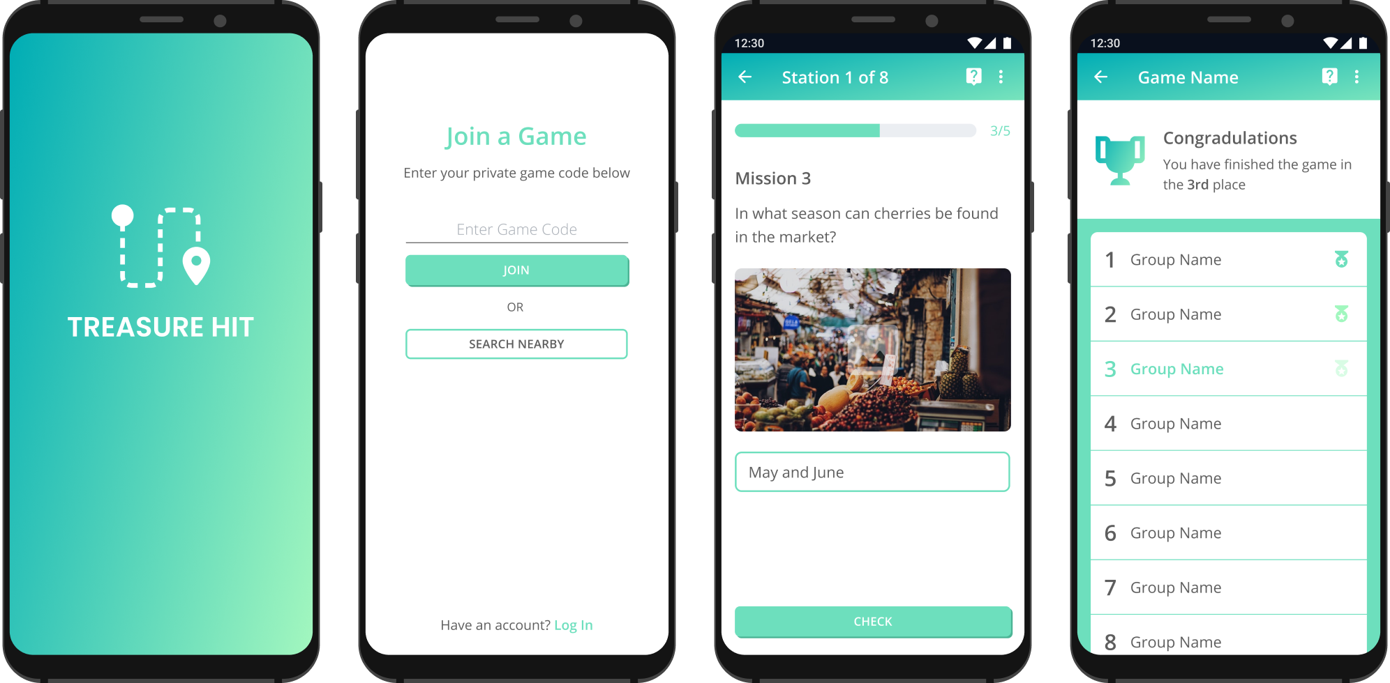
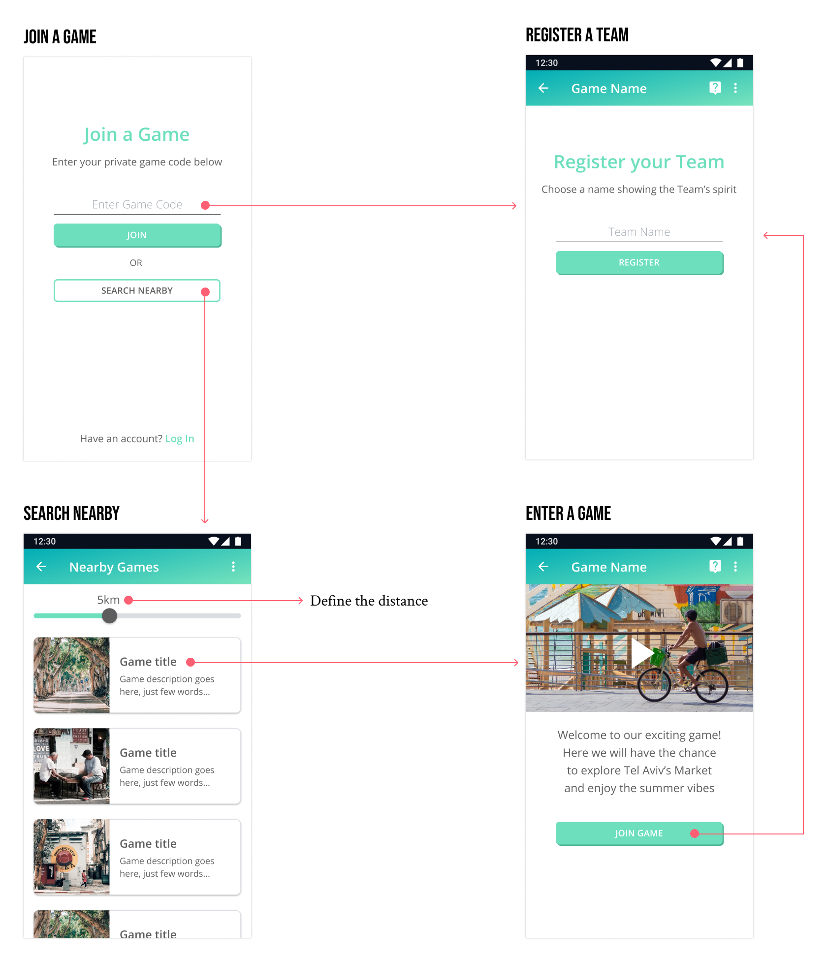
Updated and clear interface for joining a game: a simple choice between entering a specific game and browsing nearby games, followed by team registration.
The missions
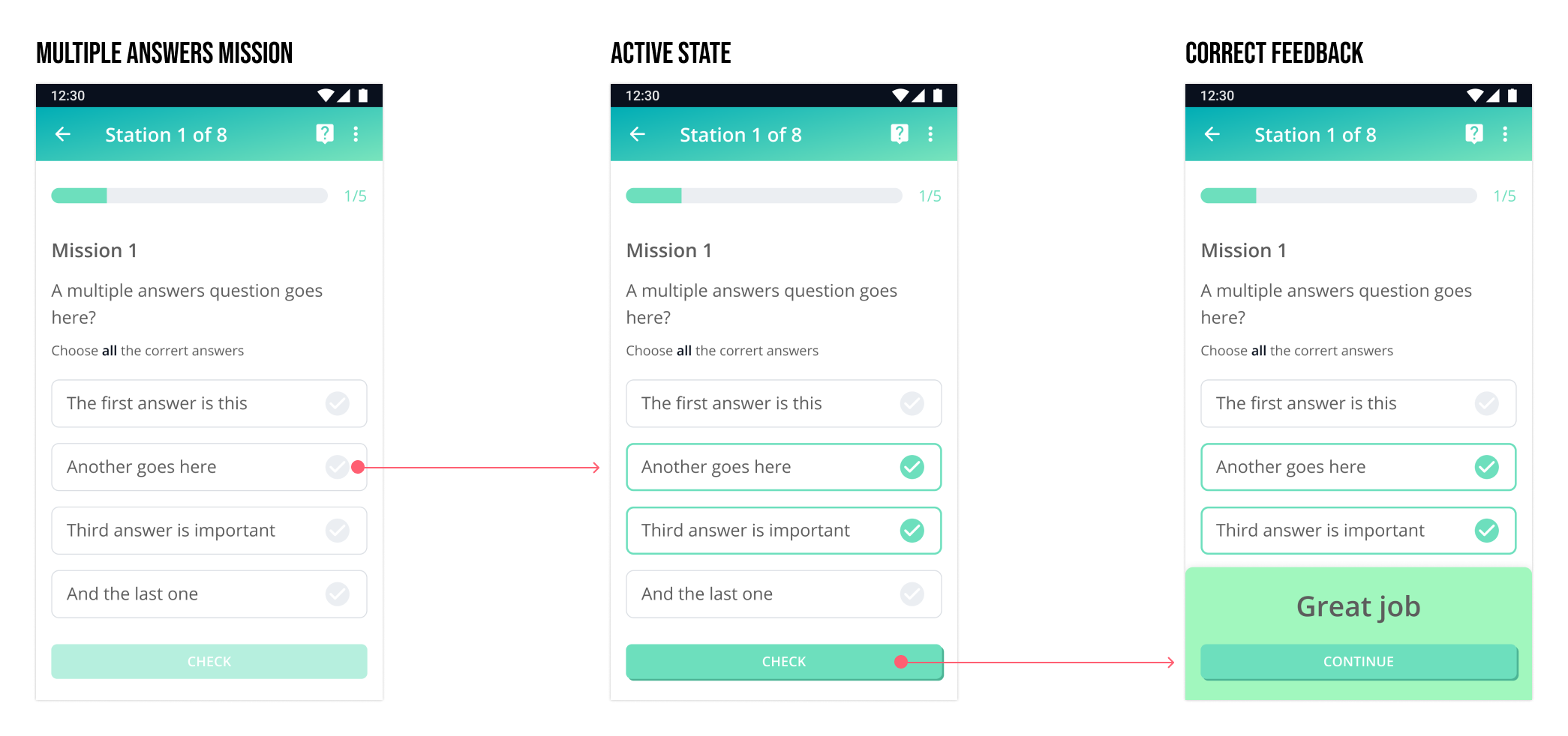
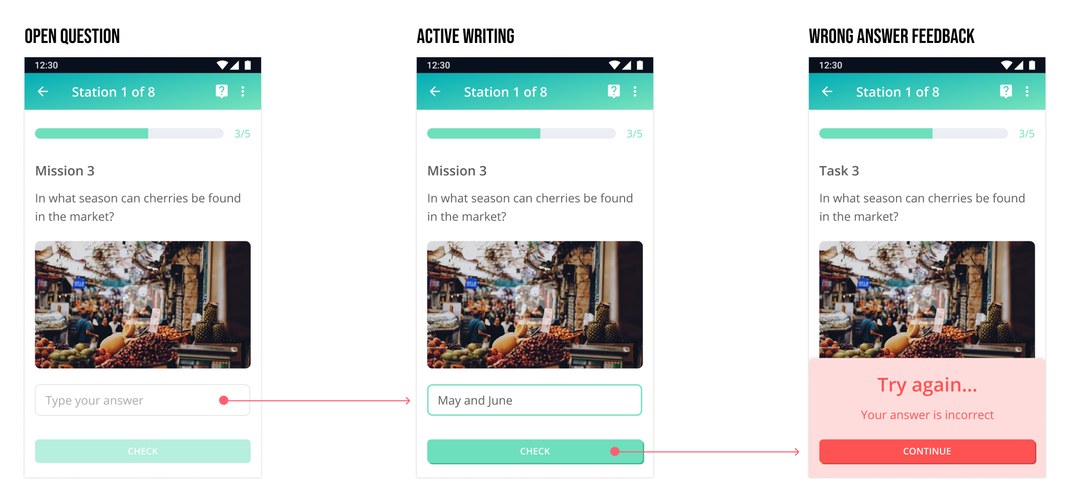
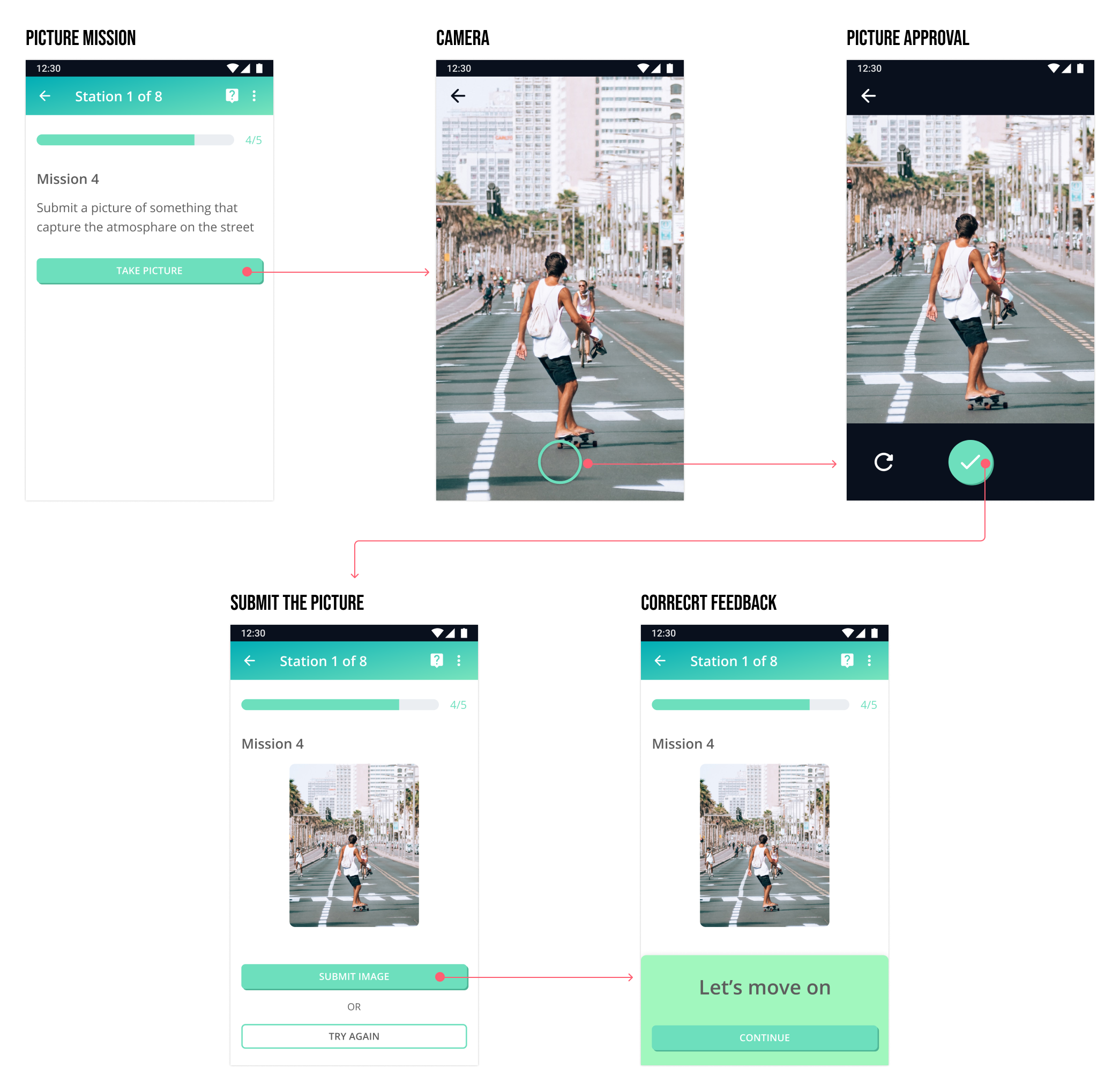
One of the main features of the game is the variety of missions; while playing, a user can meet Multiple Answers, Open Question, Picture and Free Writing missions. The updated flow and interactions allow the users to have a fun and informal experience replacing the previous didactic approach.
Notifications
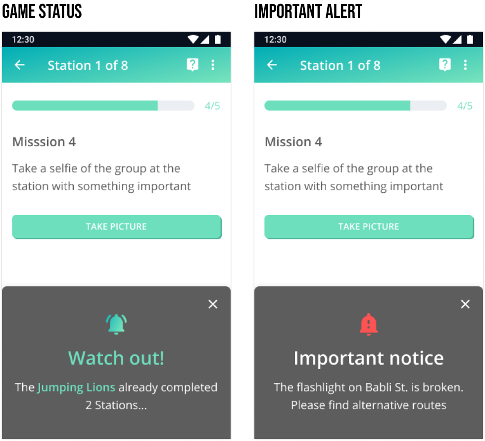
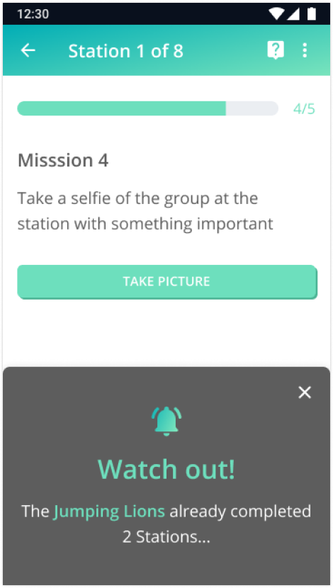
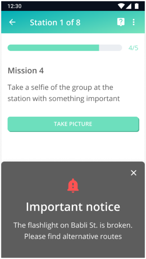
Notifications were added to allow communication between the players and the game manager, increasing safety and clarity. Two main types of notifications were added: Game Status and Alerts. The Game Status aims to motivate the players and keep high level of competition and the Alerts are important messages from the Game Manager
Game status
important alert
After the game
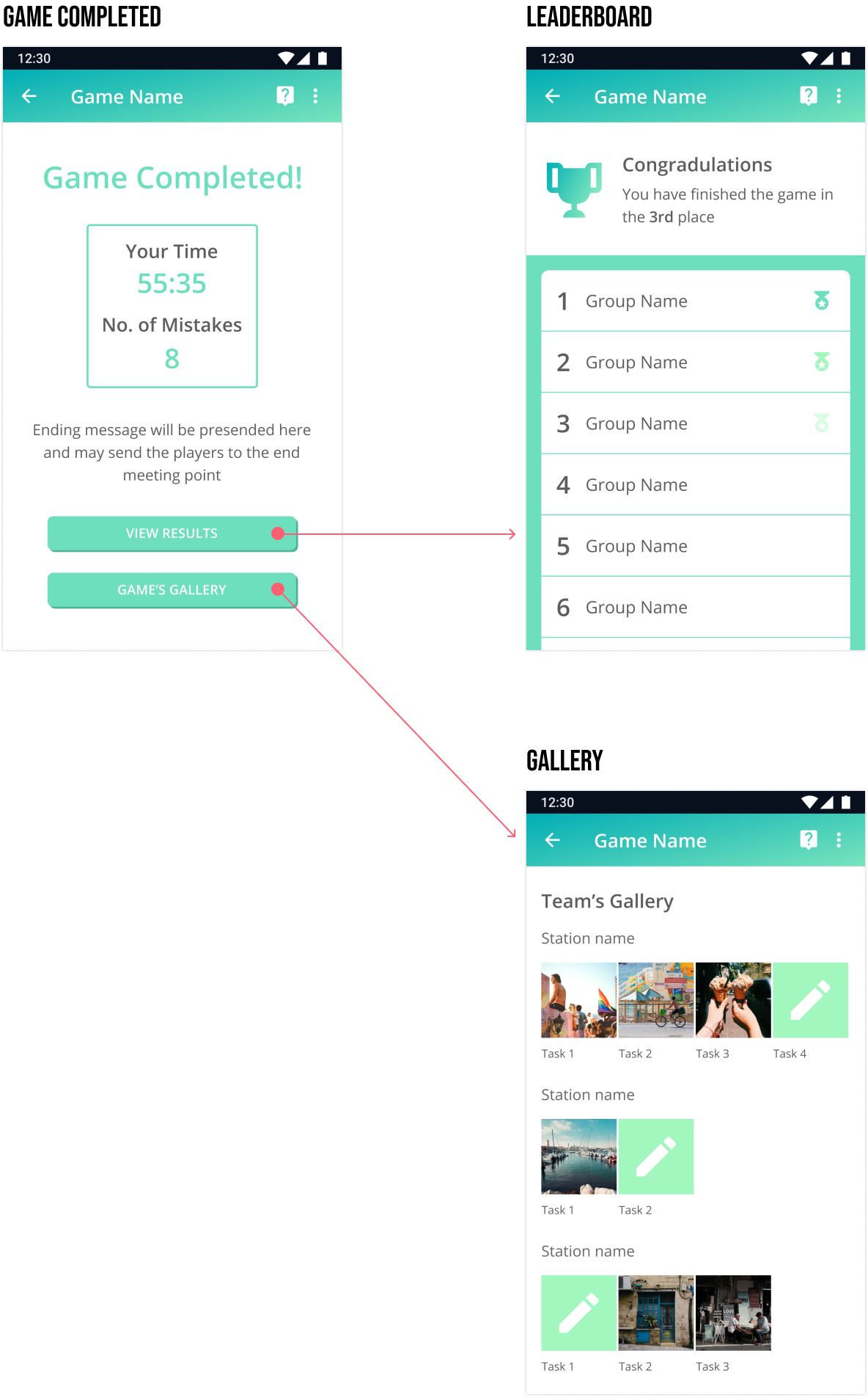
When the game is finished, the players receive a report of their achievements, and can enter and review their team’s Gallery and the game’s Leaderboard. By receiving this competitive feedback, the players finish the game with satisfaction and an opportunity to review and learn from their accomplishments during the game.
final thoughts
My main challenge in the redesign of the mobile app was to create an effortless experience for the players, for them to be able to concentrate on the game and not struggle with the interface. Another important goal was to gamify the experience and boost the “fun” effect so the game will not feel like an exam or an educational assignment. I think that the clear CTAs and the immediate feedbacks introduced in the new design would both help to achieve these goals.
Some of the main features that were added to the new design are the notifications and the option to chat with the game manager during the game. I’m looking forward to seeing how the players gain more confidence with these new features of the mobile app.
Creating a better connectivity between the teams and boosting the competition were another challenge. Now, the players can receive notifications about the progress of other teams, in addition to having access to the leaderboard to see how they performed in the game.
A main feature that was not included in the scope of this redesign and is still missing is a mobile app section for the game managers, to track the teams while playing, review the submissions on real time and edit the game if needed. I hope that in the future we will be able to add this part to provide a complete experience.